UX / UI Design Systems
WEB DESIGN SYSTEM FOUNDATION
Developed the foundational design system supporting the Guru Hub website redesign, defining visual consistency, responsive behavior, and UI structure to guide final implementation.
Year :
2023
Industry :
BPO / B2B Services
Client :
The Office Gurus
Scope :
Design System / UI Structure / Responsive Framework / Documentation
Problem :
As the organization prepared for website evolution and rebranding, there was no structured visual system to ensure consistency across layouts, typography, spacing, and components.
A scalable foundation was needed before full design and development execution.
Solution :
I developed a preliminary Figma-based design system framework to support structured implementation.
This included:
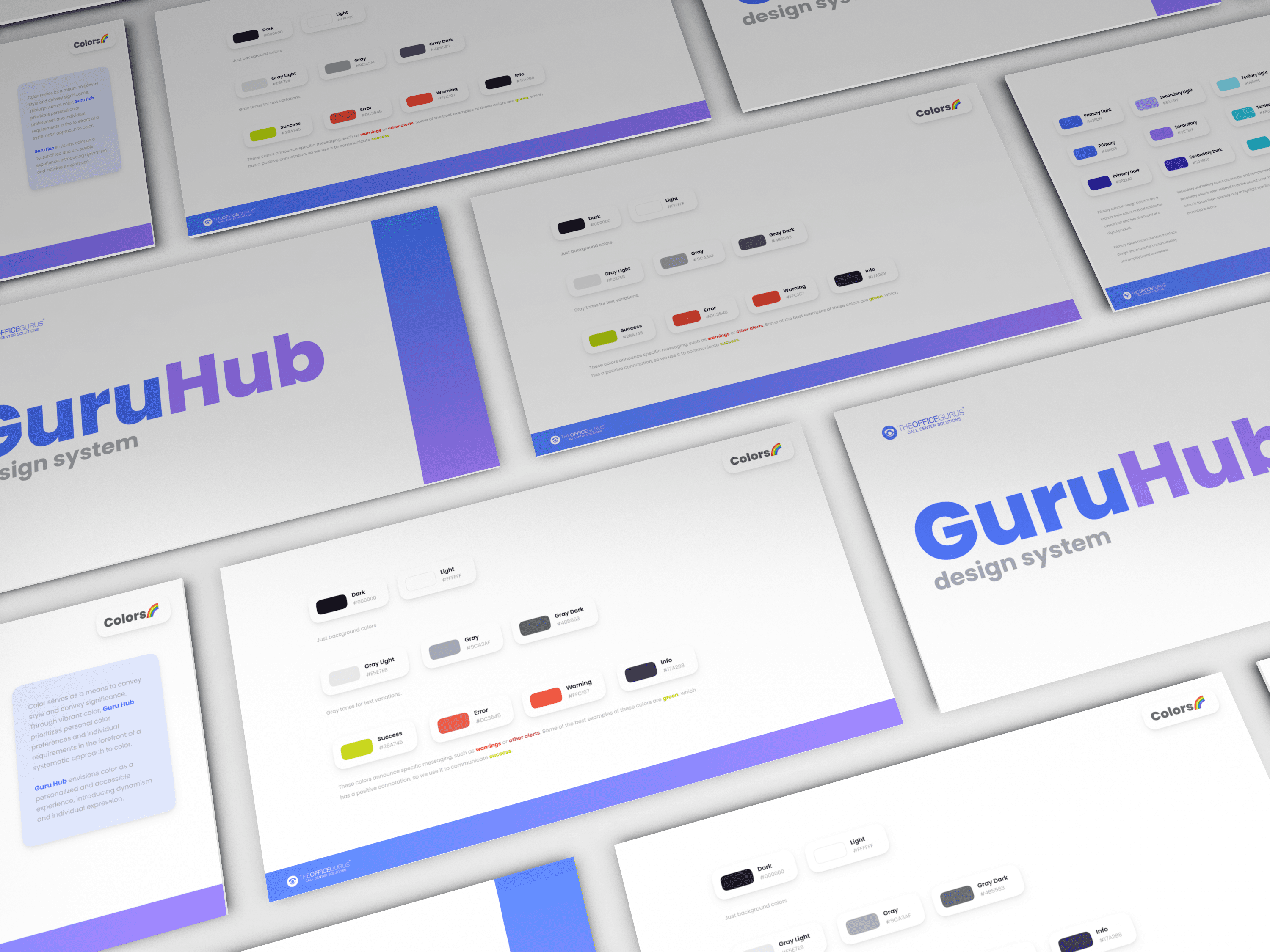
• Defining the primary, secondary, and state-based color system
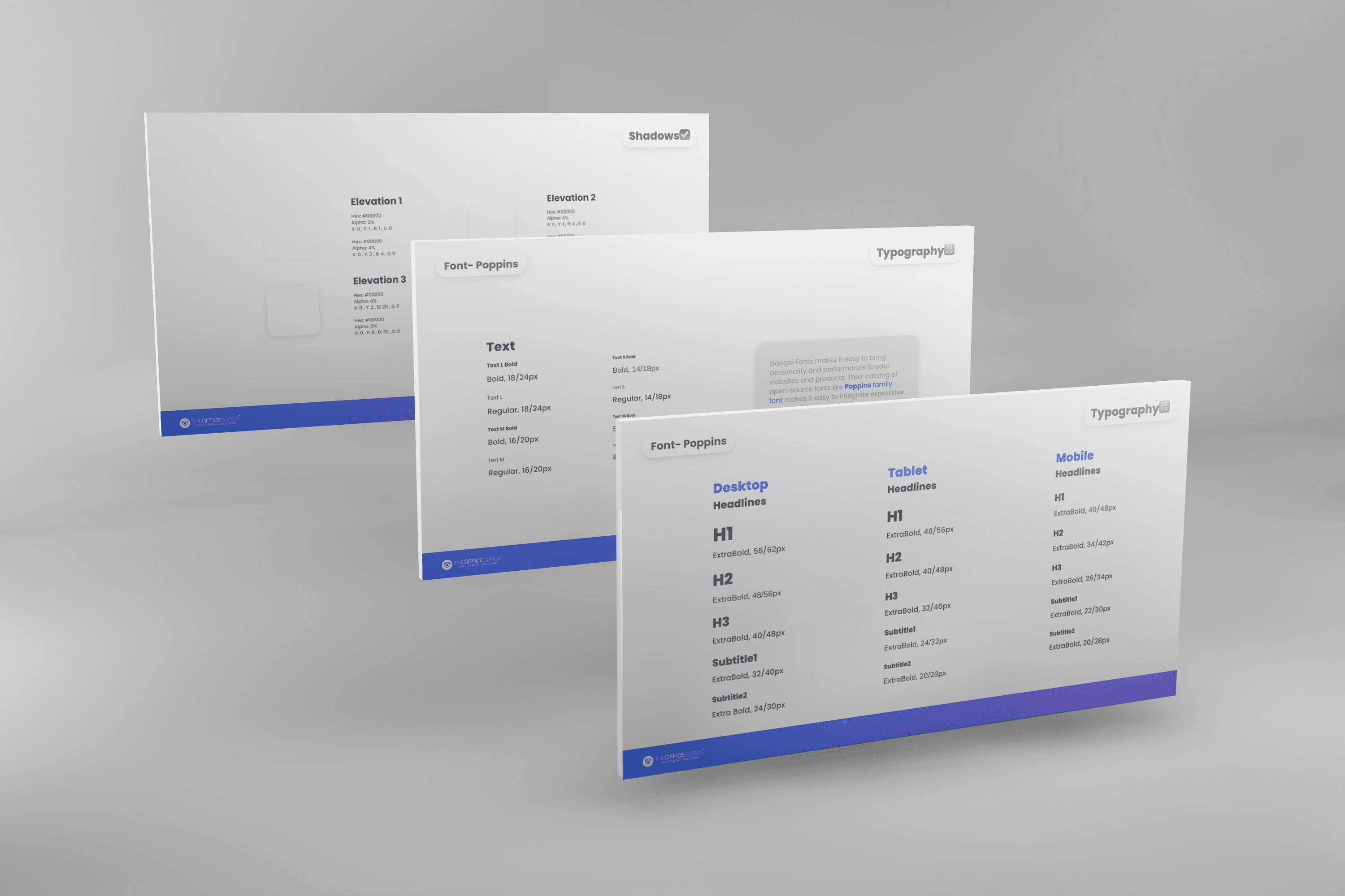
• Establishing typography hierarchy for Desktop, Tablet, and Mobile
• Creating an 8pt spacing grid to ensure layout consistency
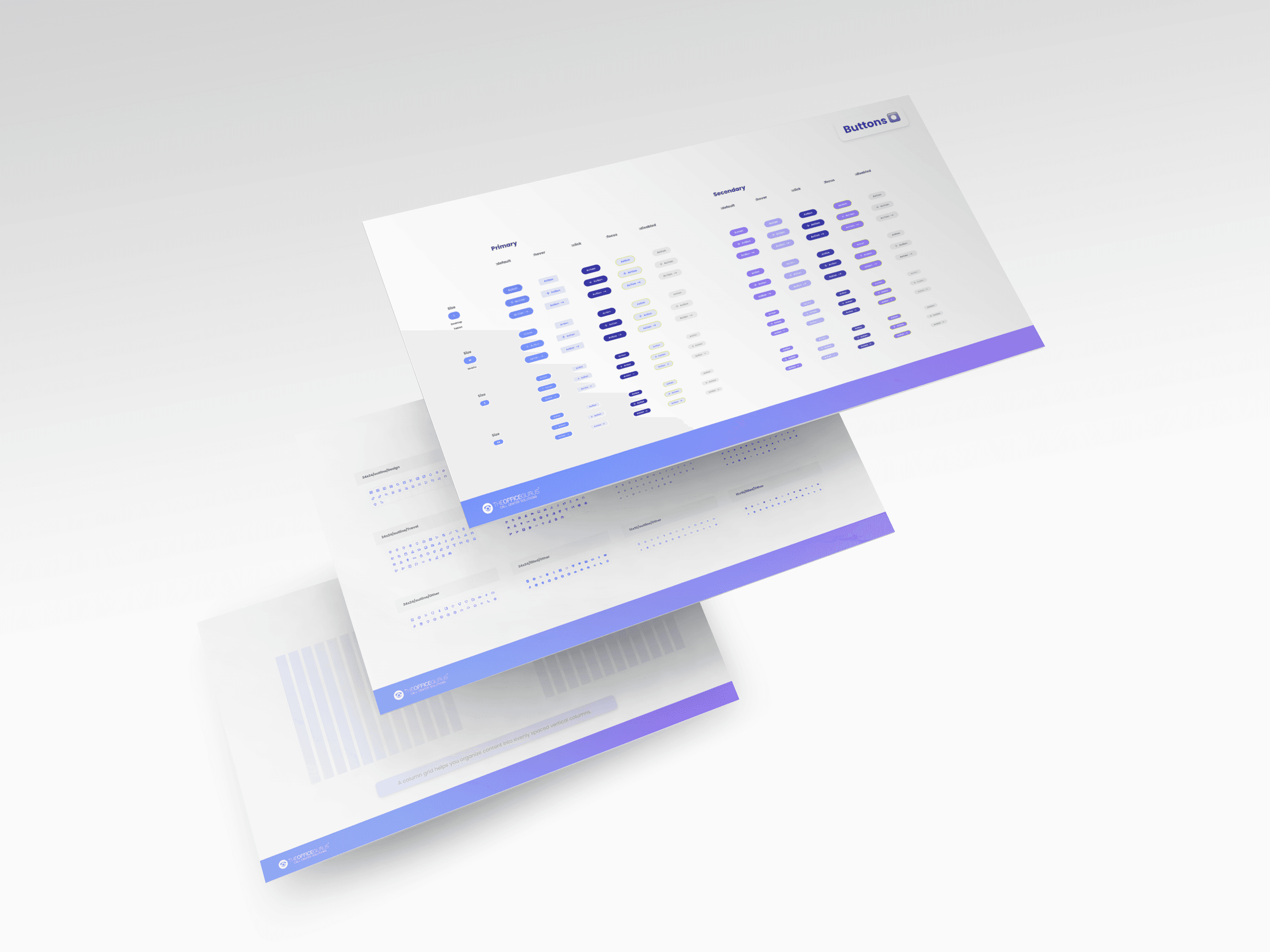
• Structuring button states (default, hover, focus, disabled)
• Defining icon sizing standards (16px / 24px)
• Establishing shadow and elevation guidelines
• Documenting responsive layout logic for cross-device alignment
The system served as the visual and structural foundation guiding the final website build.
Challenge :
Creating a scalable and modular design structure that could reduce inconsistencies, simplify collaboration, and provide clarity during implementation.
Summary :
The framework established visual coherence and component reusability, laying the groundwork for a more structured and scalable web experience aligned with the brand’s evolving positioning.
More Projects


UX / UI Design Systems
WEB DESIGN SYSTEM FOUNDATION
Developed the foundational design system supporting the Guru Hub website redesign, defining visual consistency, responsive behavior, and UI structure to guide final implementation.
Year :
2023
Industry :
BPO / B2B Services
Client :
The Office Gurus
Scope :
Design System / UI Structure / Responsive Framework / Documentation
Problem :
As the organization prepared for website evolution and rebranding, there was no structured visual system to ensure consistency across layouts, typography, spacing, and components.
A scalable foundation was needed before full design and development execution.
Solution :
I developed a preliminary Figma-based design system framework to support structured implementation.
This included:
• Defining the primary, secondary, and state-based color system
• Establishing typography hierarchy for Desktop, Tablet, and Mobile
• Creating an 8pt spacing grid to ensure layout consistency
• Structuring button states (default, hover, focus, disabled)
• Defining icon sizing standards (16px / 24px)
• Establishing shadow and elevation guidelines
• Documenting responsive layout logic for cross-device alignment
The system served as the visual and structural foundation guiding the final website build.
Challenge :
Creating a scalable and modular design structure that could reduce inconsistencies, simplify collaboration, and provide clarity during implementation.
Summary :
The framework established visual coherence and component reusability, laying the groundwork for a more structured and scalable web experience aligned with the brand’s evolving positioning.
More Projects
UX / UI Design Systems
WEB DESIGN SYSTEM FOUNDATION
Developed the foundational design system supporting the Guru Hub website redesign, defining visual consistency, responsive behavior, and UI structure to guide final implementation.
Year :
2023
Industry :
BPO / B2B Services
Client :
The Office Gurus
Scope :
Design System / UI Structure / Responsive Framework / Documentation
Problem :
As the organization prepared for website evolution and rebranding, there was no structured visual system to ensure consistency across layouts, typography, spacing, and components.
A scalable foundation was needed before full design and development execution.
Solution :
I developed a preliminary Figma-based design system framework to support structured implementation.
This included:
• Defining the primary, secondary, and state-based color system
• Establishing typography hierarchy for Desktop, Tablet, and Mobile
• Creating an 8pt spacing grid to ensure layout consistency
• Structuring button states (default, hover, focus, disabled)
• Defining icon sizing standards (16px / 24px)
• Establishing shadow and elevation guidelines
• Documenting responsive layout logic for cross-device alignment
The system served as the visual and structural foundation guiding the final website build.
Challenge :
Creating a scalable and modular design structure that could reduce inconsistencies, simplify collaboration, and provide clarity during implementation.
Summary :
The framework established visual coherence and component reusability, laying the groundwork for a more structured and scalable web experience aligned with the brand’s evolving positioning.